Hi, I’m PARVEJ HOSSAIN
a
GIS Enthusiast.
Cartographer.
Geospatial Data Analyst.
Skilled in Python, R, and GIS software like ArcGIS Pro, ArcMap, QGIS, and Erdas Imagine, with practical experience in analyzing environmental data. Eager to learn from experts and contribute to impactful research that promotes sustainability and addresses global climate challenges.

Skilled on

Educational Qualification
My Portfolio
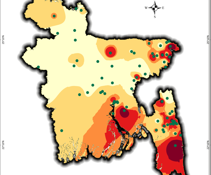
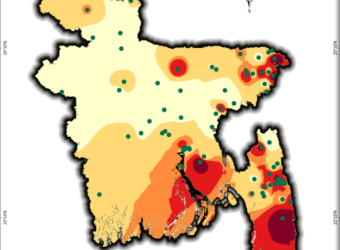
Mapping Bangladesh’s Seismic Risks
Through a wide variety of mobile applications, we’ve developed a unique visual system.
- Software ArcGIS Pro
- Timeframe 2001-2025
- Data USGS
- Study Area Bangladesh
Using USGS earthquake data, I created a seismic risk map of Bangladesh, classifying zones from very low to very high risk. This helps visualize earthquake vulnerability for disaster preparedness and urban planning. A critical tool for policymakers, researchers, and communities!
What It Shows:
- Data Span: Earthquake occurrences from 2001–2025 (magnitude, location).
- Risk Zones: 5-tier classification (very low to very high ) based on interpolated seismic activity.
For high quality image visit this linkHow to Make One for Yourself:
Data Collection:
- Download earthquake data (2001–2025) from USGS Earthquake Catalog.
- For download Bangladesh data, use Geographic region as custom and give the North, South, East, West location in the box.
- Then download the data in CSV format.

Shape file Prep:
- Get Bangladesh’s administrative boundary shape file from GADM or DIVA-GIS or Hum data website.
- Then add the csv to ArcGIS and show it as xy table to point, select the magnitude field as Z field and longitude as x, latitude as x.
- Then export this feature as a shape file.
- Then clip the earthquake shape file based on BD administrative boundary.
“Mapping risks today ensures safer cities tomorrow.”
Interpolation in ArcGIS Pro:
- Use Kernel Density or IDW tools to map seismic intensity.
- For IDW spatial analyst tool, select the earthquake shape file as input point feature , select magnitude field as Z field value.
- Give an output name and location and in the Environments tab select coordinate system as wgs1984.
- Select the Extent and Mask in Raster Analysis as BD shape file.
Risk Classification:
- Reclassify the interpolated raster into 5 zones using Equal Intervals or Natural Breaks from the symbology pan of the IDW.
- Then change the color as you like.
Design & Export:
- Add legends, scale bars, and labels. Use color ramps (e.g., green → red) for clarity.
- Export as PDF/high-res image for sharing.
Need Help?
If you’re interested in replicating this project or need guidance for your region, feel free to reach out! I’m happy to share workflows, data sources, or troubleshoot GIS challenges. Let’s collaborate to build resilient communities. 🌍✨
Email: official.parvej.hossain@gmail.com
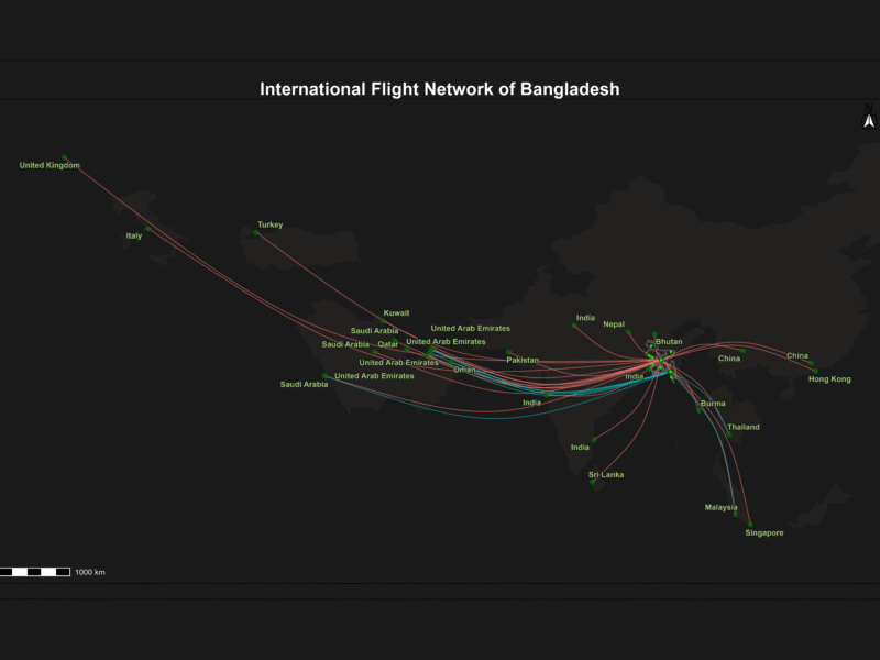
Bangladesh International Flight Network
Through a wide variety of mobile applications, we’ve developed a unique visual system.
- Software ArcGIS Pro
- Date 21/05/2025
- Data Open Flights
This project visualizes Bangladesh’s international flight routes on a dynamic Leaflet map using interactive, curved spatial lines and airport points. It features multi-layer map styles, smooth hover effects with detailed popups, and a legend highlighting key airports. A live flight radar widget is embedded to provide real-time air traffic data over Bangladesh, making the map informative and engaging. This tool is a powerful visualization for aviation analysis, travel planning, and geospatial storytelling.
How I built it (in a nutshell):
1. Set Up Your Environment
Install needed packages by running:
Install R and RStudio (if not installed).
install.packages(c("tidyverse", "sf", "leaflet", "htmltools", "htmlwidgets", "viridis", "geosphere"))
2. Prepare Your Data
- Download the shapefile for Bangladesh administrative boundaries.
- Download airport and route data (e.g., from OpenFlights: airports.dat, routes.dat).
- Read the shapefile with
sf::st_read(). - Load airports and routes as CSV using.
read.csv().
3. Filter and Clean Data
- Filter airports for Bangladesh only (
Country == "Bangladesh"). - Select international routes starting from BD airports and going outside airports with no stops.
- Join the airport info to the routes for coordinates.
“This Map is Built using the help of AI. Use AI if you can controll the command.”
4. Create Curved Flight Lines
- Use
geosphere::gcIntermediate()to create smooth curved paths between the origin and destination airports. - Convert these to
sfspatial lines (st_linestring).
5. Build Your Leaflet Map
- Initialize leaflet with desired base maps (e.g., CartoDB.DarkMatter, Esri.WorldImagery).
- Add the Bangladesh polygon shapefile with a semi-transparent fill.
- Add curved flight lines with color coding by source airport, dashed lines, and pop-up info.
- Add airport points (circles) with hover tooltips using sticky labels.
- Use invisible, thicker lines under flight routes to improve hover sensitivity.
6. Add Interactivity
- Add JavaScript event handlers via
htmlwidgets::onRender()to:- Highlight flight lines on hover with a thicker blue dashed style.
- Show/hide popups smoothly.
- Use sticky
labelOptions(sticky = TRUE)on airports to avoid flickering hover popups.
7. Add Title and Legend
- Use
leaflet::addControl()to add a bold title at the top center. - Use
leaflet::addLegend()to show color-coded BD airports with full names.
8. Embed Live Flight Radar Map
- Embed an iframe from a flight radar website (like AirNavRadar) in a Leaflet control at the bottom left.
- Resize iframe (e.g., 350×270 px) to fit nicely inside the map.
- Style iframe container with border and rounded corners.
9. Save and Share
- Save your map as a self-contained HTML file using.
htmlwidgets::saveWidget(). - Open in any browser to explore and share.
10. Tips for Improvement
Experiment with other airport or flight data sources.
Adjust hover sensitivity by adding invisible, thicker lines under routes.
Use sticky labels to smooth the airport name hover.
Customize colors and line styles with colorFactor() and dashArray.
Explore more Leaflet providers for different map styles.
LULC Transformation in Kutupalong Refugee Camp (2017–2024)
- Software ArcMap
- Timeframe 2017-2024
- Data Sentinel 2
- Study Area Kutupalong Camp
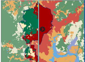
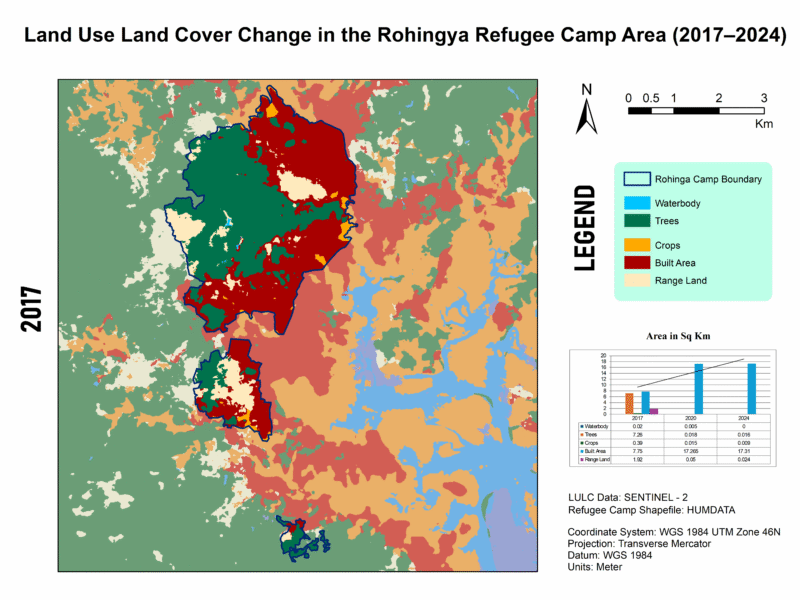
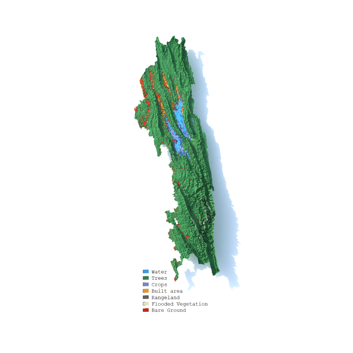
This series illustrates land use and land cover (LULC) shifts across three key years—2017, 2020, and 2024—highlighting dramatic environmental changes in response to Rohingya settlement. Between 2017 and 2024, built-up areas surged from 7.75 km² to 17.31 km², while tree cover plummeted from 7.26 km² to just 0.016 km², indicating large-scale deforestation—trends confirmed by satellite-based studies showing up to 74% forest loss from 2015–2021 and over 3,200 ha cleared by 2024.
What It Shows:
- Mapping the Transformation: Land Cover Change in Kutupalong Refugee Camp (2017–2024)
For high quality image visit this link🖼️ Map 1: 2017 LULC Baseline
Description: The map reveals a relatively modest built-up footprint (7.75 km²) and robust tree cover (7.26 km²), set against 1.92 km² of rangeland and small waterbodies. This pre-expansion snapshot reflects early stages following the 2017 refugee influx, with natural forest still dominant and human infrastructure beginning to take hold.
📍 Qualitative Insight: The area had yet to experience significant land clearance—UN data indicates ~1,219–1,313 ha were cleared by early 2018.
For high quality image visit this link🖼️ Map 2: 2020 LULC – Peak Transformation
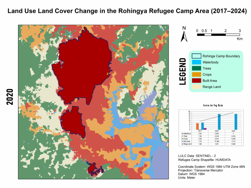
Description: By 2020, built-up area had more than doubled (17.27 km²) while tree and crop cover collapsed to near-zero levels. Waterbodies shrank to only 0.005 km², rangeland nearly vanishing (0.05 km²).
📍 Quantitative Insight: In just three years, settlements expanded roughly tenfold, echoing reports of ~71% forest loss from 2015–2018 and dramatic wetland increases, though only until 2018, matching observed exponential LULC shifts.
For high quality image visit this link🖼️ Map 3: 2024 LULC – Stabilization or Continuing Loss?
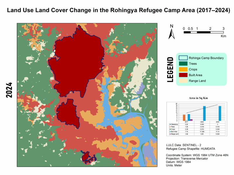
Description: The latest map shows built-up area plateauing (~17.31 km²), but vegetation remains decimated (trees: 0.016 km²; crops: 0.009 km²), and open rangeland is minimal (0.024 km²). Waterbodies are effectively gone.
📍 Contextual Insight: This aligns with findings of ~3,200 ha of forest clearance by 2024 and ongoing rehabilitation efforts on degraded lands, though full ecological recovery has yet to materialize.
📊 Integrating My Data (2017–2024)
| Year | Waterbodies | Trees | Crops | Built-up | Rangeland |
|---|---|---|---|---|---|
| 2017 | 0.02 km² | 7.26 km² | 0.39 km² | 7.75 km² | 1.92 km² |
| 2020 | 0.005 km² | 0.018 km² | 0.015 km² | 17.27 km² | 0.05 km² |
| 2024 | 0 km² | 0.016 km² | 0.009 km² | 17.31 km² | 0.024 km² |
These figures demonstrate dramatic deforestation and urban expansion up to 2020, with built-up area stabilizing thereafter—likely due to space saturation—while natural land cover remains critically low.
Between 2017 and 2024, the rapid influx of Rohingya refugees into Cox’s Bazar has devastated the region’s natural environment. Approximately 8,000 acres of forest—around 6,164 acres inside camp boundaries and another 1,837 acres around—were cleared, primarily for shelter construction and firewood rsisinternational.org+7pmc.ncbi.nlm.nih.gov+7aljazeera.com+7rsisinternational.org+2en.wikipedia.org+2undrr.org+2. This large-scale deforestation extended over 26,600 hectares of forest in surrounding Ukhia, Whykong, and Teknaf ranges, impacting critical biodiversity zones like Teknaf Wildlife Sanctuary, Inani, and Himchhari National Parks, and pushing wildlife, including endangered Asian elephants, into closer and often dangerous proximity with humans. Removal of vegetation and hill cutting—50% of which was observed in some spots—has severely destabilized slopes, triggering widespread soil erosion, frequent landslides, flash floods, and even hill collapses during the monsoon reddit.com. The disappearance of groundcover further increased surface heat and disrupted natural water retention, leading to rising land surface temperatures (~+7–8 °C) and reduced groundwater levels due to excessive tube-well use reddit.com+10mdpi.com+10icccad.net+10. This has led to a cascade of adverse effects: habitat fragmentation, human–wildlife conflicts, heightened flood risk, pollution of water sources, and loss of ecosystem services, including biodiversity, carbon storage, and soil fertility rsisinternational.org. While some mitigation efforts—such as vetiver grass planting and reforestation programs by IOM, FAO, and UN agencies—have begun to stabilize slopes and reduce landslide incidents, the scale of ecological damage remains vast and long-term resilience demands sustained restoration and strategic land-use planning iom.int+1undrr.org+1.
Need Help?
If you’re interested in replicating this project or need guidance for your region, feel free to reach out! I’m happy to share workflows, data sources, or troubleshoot GIS challenges. Let’s collaborate to build resilient communities. 🌍✨
Email: official.parvej.hossain@gmail.com
Multi-Spectral Index Analysis of the Sundarban Mangrove Forest
- Software ArcGIS Pro
- Date 21/08/2025
- Category Remote Sensing
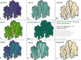
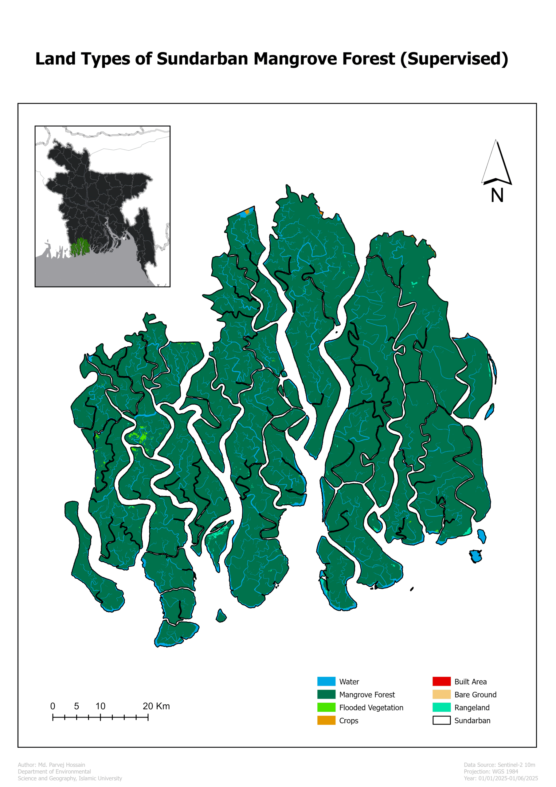
Here’s an analysis of the Sundarban Mangrove Forest using various multi-spectral indices derived from satellite imagery. These indices are powerful tools for monitoring the health of vegetation, water bodies, and soil.
Why This Analysis Matters 💡
Monitor vegetation health: NDVI, GNDVI, and SAVI help track the vitality of mangrove trees, indicating areas of stress or degradation. Map water resources: NDWI and MNDWI are essential for mapping the complex network of rivers and channels, which is vital for understanding the hydrology of this dynamic estuarine system. Assess moisture content: NDMI and NDII provide insight into the moisture levels of soil and vegetation, which is crucial for a forest that depends on a specific salinity balance.
Map water resources: NDWI and MNDWI are crucial for mapping the intricate network of rivers and channels, essential for understanding the hydrology of this dynamic estuarine system.
Assess moisture content: NDMI and NDII provide insight into the moisture levels of both the soil and vegetation, which is vital for a forest that relies on a specific salinity balance.
- Normalized Difference Vegetation Index (NDVI)
The NDVI is a widely used vegetation index that measures the difference between near-infrared (NIR) and red light reflected by vegetation. Healthy plants absorb red light for photosynthesis and reflect high amounts of NIR light, resulting in a high NDVI value. Unhealthy or sparse vegetation, as well as non-vegetated areas like water or soil, have much lower values.
NDVI=(NIR-RED)/(NIR+RED)
Importance:
NDVI is crucial for assessing vegetation health, density, and biomass. It’s a key tool for monitoring agricultural fields, assessing forest health, and tracking seasonal changes in vegetation. Its simplicity and effectiveness have made it a cornerstone of remote sensing applications.
Analysis of Sundarban Data:
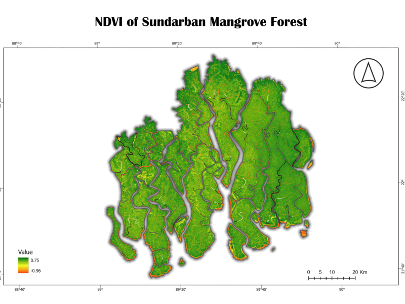
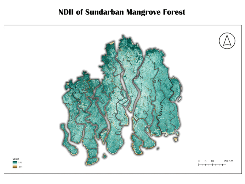
The NDVI map for the Sundarban shows a significant majority of the area in shades of green, indicating a high density of healthy vegetation. The highest values (bright green) are found in the core, densely forested areas. The lower values (yellow and orange) are concentrated along the riverbanks and coastal fringes, suggesting either sparse vegetation or the presence of a mix of land and water. The very low values (darker shades) correspond to open water bodies. The overall high NDVI values confirm that the Sundarban remains a remarkably healthy and dense forest ecosystem.
2. Green Normalized Difference Vegetation Index (GNDVI)
The GNDVI is a vegetation index similar to NDVI, but it uses the green band instead of the red band. This index is particularly sensitive to chlorophyll content in leaves, making it a better indicator of vegetation stress, especially in crops or when analyzing a wider range of chlorophyll concentrations.
NDVI=(NIR-GREEN)/(NIR+GREEN)
Importance:
GNDVI is valuable for detecting early signs of plant stress, which may not be visible in NDVI. It is also less prone to saturation than NDVI in areas of high biomass, making it helpful in monitoring very dense forests.
Analysis of Sundarban Data:
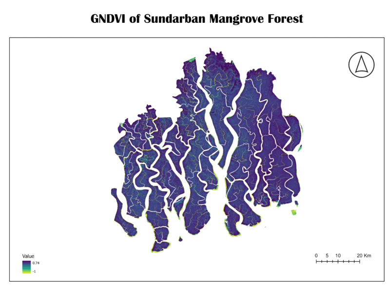
The GNDVI map of the Sundarban is characterized by deep blue and purple hues, with a few pockets of light green and yellow. This color scheme suggests that while the vegetation is healthy, there’s a wide range of chlorophyll content. The very high values (light green/yellow) might indicate areas with particularly high leaf chlorophyll, while the darker blue areas show healthy vegetation with standard chlorophyll levels. The patterns are very similar to the NDVI map, confirming the overall health of the forest.
3. Soil-Adjusted Vegetation Index (SAVI)
The SAVI is an enhanced vegetation index designed to minimize the influence of soil brightness on the vegetation signal. It incorporates a soil-adjustment factor, “L,” which accounts for variations in soil background. This makes it more reliable than NDVI in areas with low vegetation cover or exposed soil.
SAVI = ((NIR – RED) × (1 + L)) / (NIR + RED + L)
L is a soil-adjustment factor, typically set to 0.5 for most landscapes.
Importance:
SAVI is critical for accurate vegetation mapping in semi-arid regions or areas with sparse vegetation, where the reflected signal from the soil can interfere with the vegetation index. It helps to distinguish between actual vegetation and background soil noise.
Analysis of Sundarban Data:
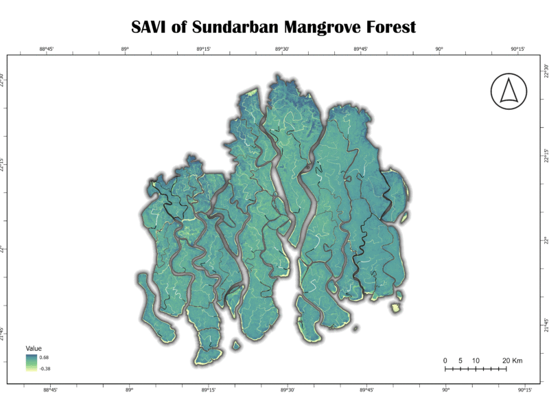
The SAVI map of the Sundarban exhibits a visual pattern very similar to the NDVI map, with healthy vegetation represented by shades of teal and green. This similarity suggests that soil background has a minimal effect on the vegetation signal in this dense, canopied forest. This is expected, as the mangrove forest floor is often covered by water or is a dense root network, minimizing exposed soil. The highest values correspond to dense vegetation, while lower values are found in waterways and coastal areas.
4. Normalized Difference Water Index (NDWI)
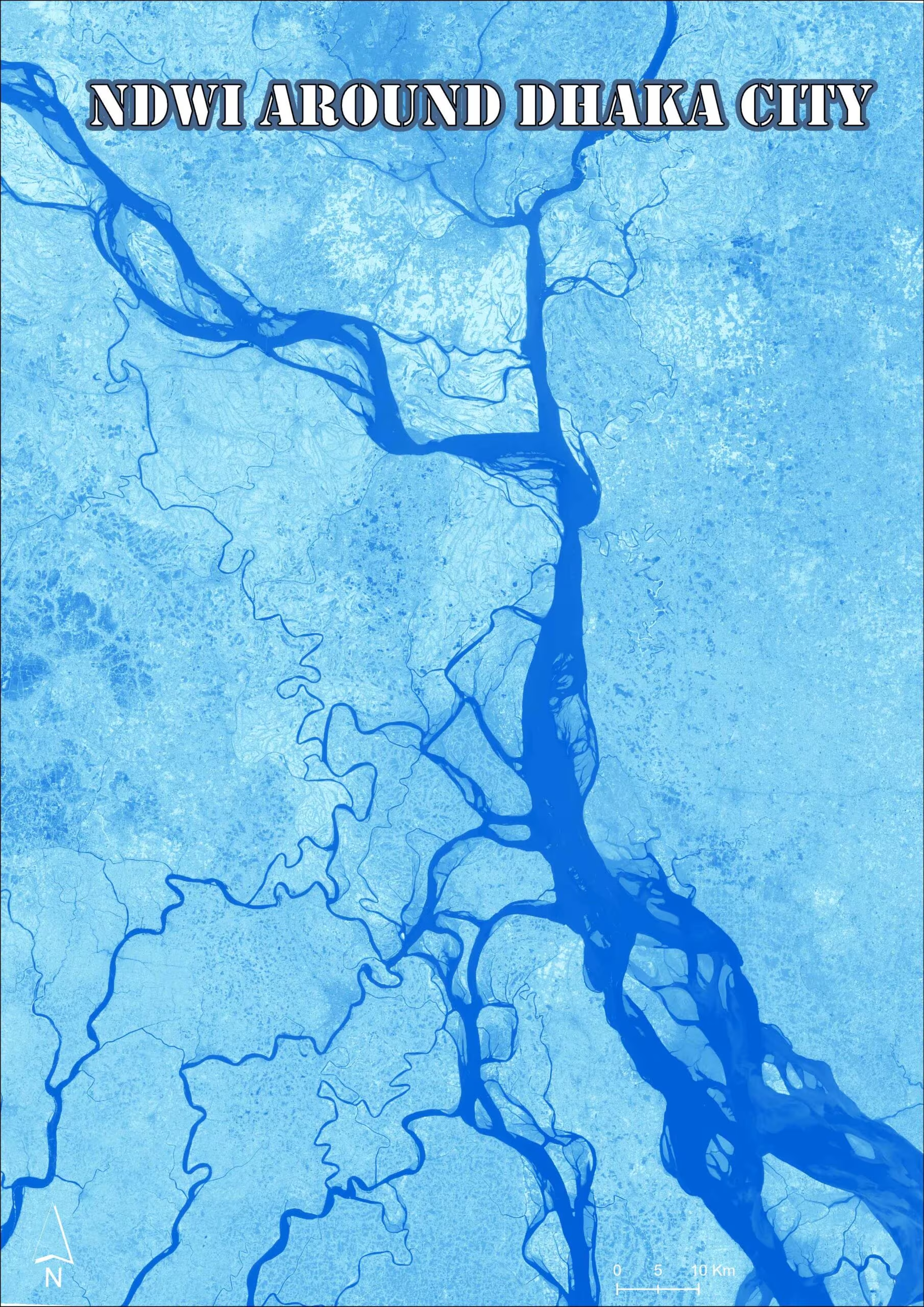
The NDWI is an index that uses the green and near-infrared bands to highlight liquid water and moisture content. It’s particularly effective for mapping surface water bodies like lakes, rivers, and coastal waters. Water bodies typically have a high positive NDWI value, while vegetation and soil have much lower or negative values.
NDWI = (GREEN – NIR) / (GREEN + NIR)
Importance:
NDWI is vital for monitoring changes in surface water extent, which is critical for flood mapping, drought monitoring, and managing water resources. In a coastal system like the Sundarban, it’s essential for mapping the extensive tidal creeks and channels.
Analysis of Sundarban Data:
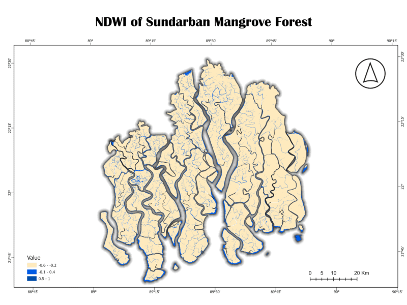
The NDWI map of the Sundarban clearly delineates the vast and complex network of waterways. The light blue shades represent the open water bodies, while the beige and gray areas correspond to land. The sharp contrast between land and water demonstrates the index’s effectiveness in this environment. The numerous small, interconnected channels are visible, highlighting the forest’s unique hydrology.
5. Modified Normalized Difference Water Index (MNDWI)
The MNDWI is an improved version of the NDWI. It replaces the NIR band with the short-wave infrared (SWIR) band, which provides better performance in discriminating water from vegetation and soil. MNDWI is more effective at suppressing noise from urban features and soil background, leading to a more precise delineation of water bodies.
MNDWI = (GREEN – SWIR) / (GREEN + SWIR)
Importance:
MNDWI is superior to NDWI for mapping water bodies in areas with high vegetation cover or where urban features are present. Its improved accuracy makes it a preferred choice for detailed hydrological mapping.
Analysis of Sundarban Data:
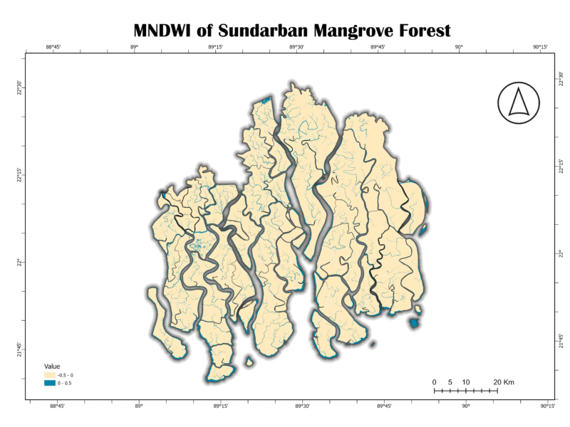
The MNDWI map for the Sundarban shows a very clear and precise representation of the waterways. Similar to NDWI, the light blue shades highlight the water. However, the land areas appear more uniform in color, suggesting that MNDWI effectively removes vegetation and other noise, providing a cleaner water mask. This is a valuable asset for studying the intricate tidal channels without interference from the dense mangrove canopy.
6. Normalized Difference Moisture Index (NDMI)
The NDMI, also known as the Land Surface Water Index (LSWI), measures the water content of vegetation and soil. It uses the NIR and SWIR bands. High NDMI values indicate high moisture content, while low values suggest dryness or areas with low water content.
NDMI = (NIR – SWIR) / (NIR + SWIR)
Importance:
NDMI is crucial for drought monitoring, assessing fire risk, and evaluating the health of wetlands and other moisture-dependent ecosystems. In a mangrove forest, it is vital to understand the balance of water and vegetation.
Analysis of Sundarban Data:
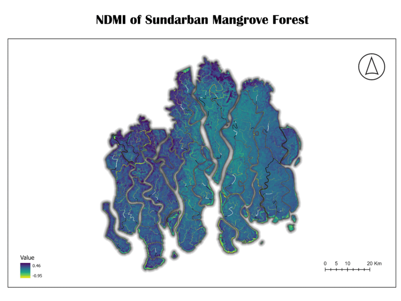
The NDMI map of the Sundarban shows high moisture levels, as expected for a tidal forest. The dark blue and green shades across the majority of the land area confirm that the vegetation and soil are saturated with water. The low values (yellow) are present along some of the coastal fringes, which might indicate areas with higher salinity or less dense vegetation. This map confirms that the Sundarban’s hydrology maintains the necessary moisture for the ecosystem’s survival.
7. Normalized Difference Infrared Index (NDII)
The NDII is another index sensitive to vegetation and soil moisture. It is structurally identical to NDMI, using the NIR and SWIR bands. The two terms are often used interchangeably in scientific literature, as they both measure the same biophysical characteristic.
NDII = (NIR – SWIR) / (NIR + SWIR)
Importance:
Like NDMI, NDII is essential for monitoring water stress in vegetation and assessing the overall moisture status of an ecosystem. Its use is critical for tracking changes in water availability and its impact on plant health.
Analysis of Sundarban Data:
The NDII map of the Sundarban shows a similar pattern to the NDMI map, with the majority of the forest area displaying high values (dark blue and green), confirming a high degree of moisture content. This redundancy in results from both NDMI and NDII strengthens the conclusion that the Sundarban is a well-hydrated ecosystem.
Conclusion
This multi-spectral index analysis of the Sundarban Mangrove Forest provides a comprehensive and detailed snapshot of the ecosystem’s current health. The maps successfully delineate key components: healthy vegetation, intricate waterways, and overall moisture content. The high values for NDVI, GNDVI, NDMI, and NDII confirm the vitality of the forest, while the clear delineation of water bodies by NDWI and MNDWI highlights the importance of the river network.
This project is an excellent example of how remote sensing can be used to monitor and manage critical ecosystems. The data serves as a valuable baseline for future studies on climate change impacts, sea-level rise, and conservation efforts. It demonstrates the power of geospatial technology in p
Spatial Canvas
Exprience

Leadership development
Harvard UniversityAspire Leaders Program 2024 Certificate
May 2024 — August 2024The Aspire Leaders Program is a transformative leadership initiative for underserved youth worldwide. It offers mentorship, networking, and resources to develop skills and unlock potential for global impact. This program has helped me develop Strategic Thinking, Communication, Networking, Public Speaking, Problem Solving, and Policy Development.
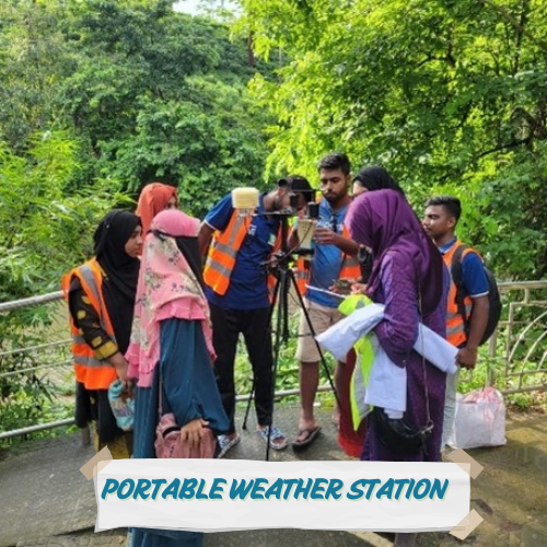
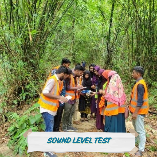
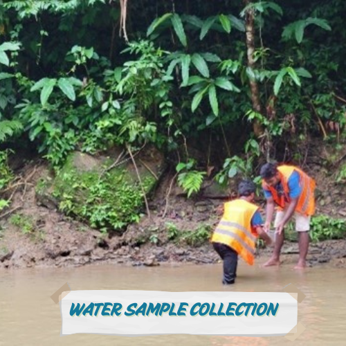
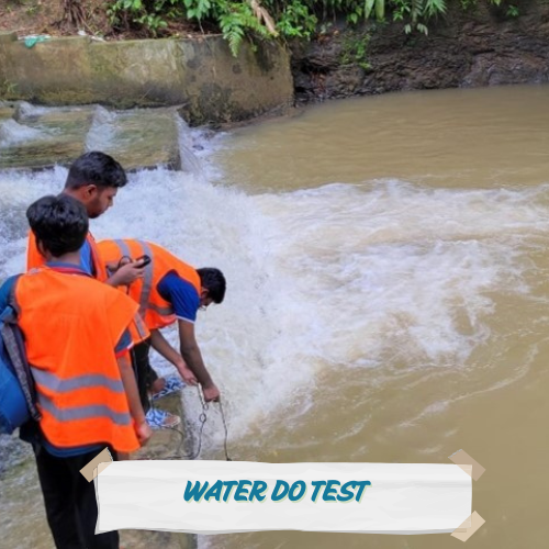
Organizer at World Environemnt Day - 2024
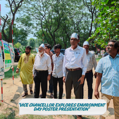
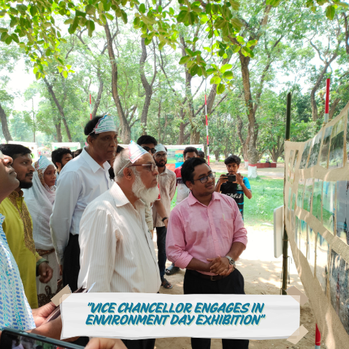


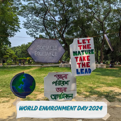
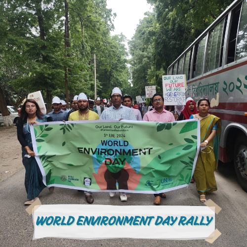
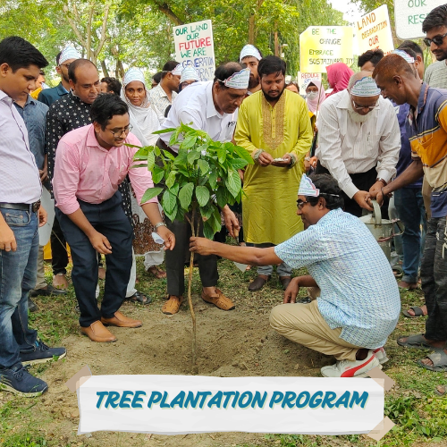


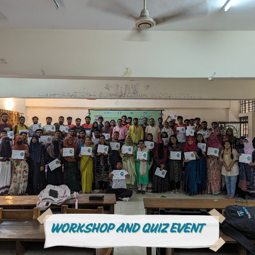
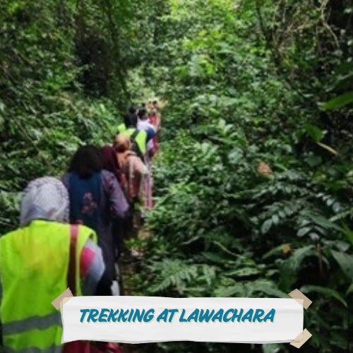
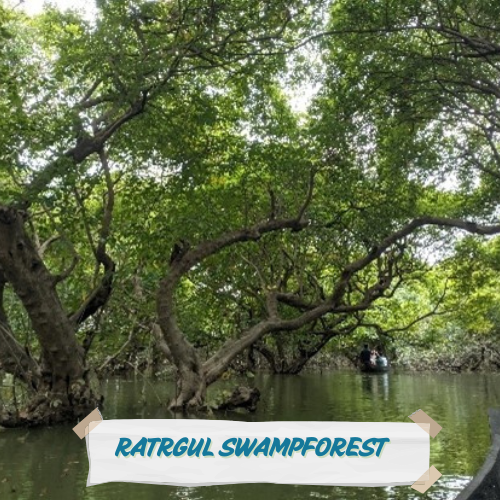
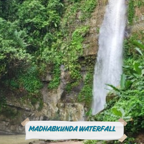
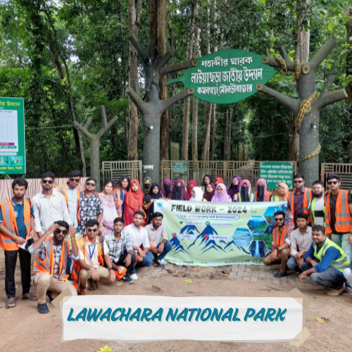
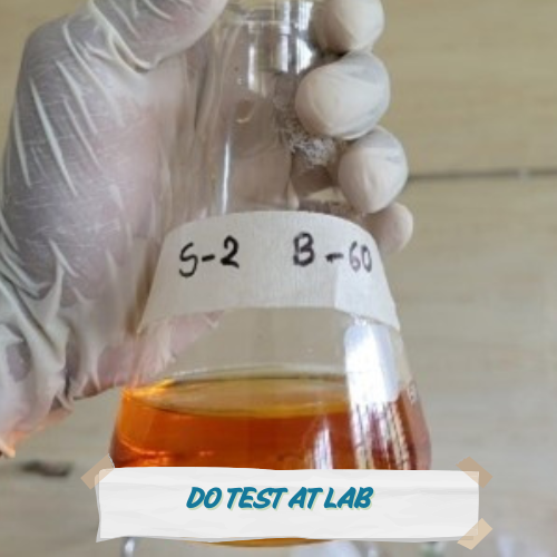
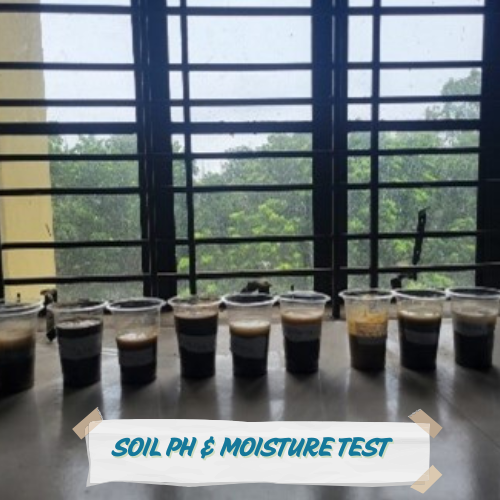
Environmental Quality Inspection at Sylhet and Moulvibazar

My Blog
Learn R – Part 4

Learn R – Part 4
1. Basic Statistical Functions
R provides built-in functions for statistical analysis:
summary(): Summary statistics (min, max, quartiles, mean).
sum(): Total of values.
range(): Minimum and maximum.
var(): Variance.
sd(): Standard deviation.
Demo Data
# Basic dataset
data_basic <- c(2, 4, 6, 8, 10)
# Advanced dataset (mtcars)
data(mtcars)

mpg <- mtcars$mpg
Practice
# BASIC TASKS
# HW1: Calculate the sum of data_basic
# HW2: Find the range (min and max) of data_basic
# HW3: Compute the variance of data_basic

# ADVANCED TASKS
# HW4: Calculate the standard deviation of mtcars$mpg

# HW5: Generate a summary of mtcars$hp (horsepower)
Solution
# BASIC SOLUTIONS
sum_basic <- sum(data_basic)
range_basic <- range(data_basic)
var_basic <- var(data_basic)

# ADVANCED SOLUTIONS
sd_mpg <- sd(mpg)
summary_hp <- summary(mtcars$hp)
2. Mean, Median, Mode
Mean : Average (mean()).
Median : Middle value (median()).
Mode : Most frequent value (no built-in function—custom code required).
Demo Data
# Basic dataset
data_numbers <- c(1, 2, 2, 3, 4, 5, 5, 5)
# Advanced dataset (iris)
data(iris)
sepal_length <- iris$Sepal.Length
Practice
# BASIC TASKS
# HW1: Calculate the mean of data_numbers
# HW2: Find the median of data_numbers
# HW3: Write a function to compute the mode

# ADVANCED TASKS
# HW4: Compute the mean of iris$Sepal.Length

# HW5: Find the median of iris$Petal.Length grouped by Species
Solution
# BASIC SOLUTIONS
mean_val <- mean(data_numbers)
median_val <- median(data_numbers)
mode_func <- function(x) {
  ux <- unique(x)
  ux[which.max(tabulate(match(x, ux)))]
}
mode_val <- mode_func(data_numbers)

# ADVANCED SOLUTIONS
mean_sepal <- mean(sepal_length)
median_petal <- aggregate(Petal.Length ~ Species, iris, median)
3. Max, Min, and Percentiles
max()/min(): Extreme values.
quantile(): Percentiles (e.g., 25th, 50th).
IQR(): Interquartile range.
Demo Data
# Basic dataset
data_scores <- c(45, 67, 89, 34, 56, 78, 90, 23)
# Advanced dataset (airquality)
data(airquality)

temp <- airquality$Temp
Practice
# BASIC TASKS
# HW1: Find the max and min of data_scores
# HW2: Calculate the 75th percentile of data_scores
# HW3: Compute the IQR of data_scores

# ADVANCED TASKS
# HW4: Find the 90th percentile of airquality$Temp

# HW5: Identify outliers in airquality$Ozone using IQR
Solution
# BASIC SOLUTIONS
max_score <- max(data_scores)
min_score <- min(data_scores)
percentile_75 <- quantile(data_scores, 0.75)
iqr_score <- IQR(data_scores)

# ADVANCED SOLUTIONS
percentile_90 <- quantile(temp, 0.90)
# Outlier detection (IQR method)
q1 <- quantile(airquality$Ozone, 0.25)
q3 <- quantile(airquality$Ozone, 0.75)
iqr <- IQR(airquality$Ozone)
outliers <- airquality$Ozone[airquality$Ozone < (q1 - 1.5*iqr) | airquality$Ozone > (q3 + 1.5*iqr)]
4. Hypothesis Testing (T-Test/ANOVA)
Perform t-tests (t.test()), ANOVA (aov()), and chi-square tests (chisq.test()) to compare groups.
Demo Data
# Create sample data
group_a <- c(20, 22, 19, 18, 24)

group_b <- c(25, 24, 22, 23, 20)
Practice
# HW1: Perform an independent t-test between group_a and group_b

# HW2: Run a one-way ANOVA on `mtcars` to compare `mpg` across cylinder groups
Solution
# HW1
t.test(group_a, group_b)
# HW2
cyl_groups <- split(mtcars$mpg, mtcars$cyl)
anova_result <- aov(mpg ~ factor(cyl), data=mtcars)
summary(anova_result)
5. Regression Analysis (Linear Regression)
Fit linear (lm()) and logistic regression models. Use summary() to interpret coefficients and p-values.
Demo Data
# Use `mtcars` for linear regression Practice
# HW1: Fit a linear model predicting `mpg` from `wt` and `hp`

# HW2: Check the R-squared value of the model
Solution
# HW1
model <- lm(mpg ~ wt + hp, data=mtcars)
# HW2
summary(model)$r.squared
6. Data Transformation
Recode variables with dplyr::mutate() and case_when(). Create new variables using arithmetic/logical operations.
Demo Data
# Create sample data
df <- data.frame(
  age = c(18, 25, 30, 35, 40),
  income = c(50000, 60000, 75000, 90000, 120000)

)
Practice
# HW1: Recode `age` into categories: "<25", "25-35", ">35"

# HW2: Create a new variable `income_group` (Low: <70k, High: >=70k)
Solution
# HW1
library(dplyr)
df <- df %>%
  mutate(age_group = case_when(
    age < 25 ~ "<25",
    age >= 25 & age <= 35 ~ "25-35",
    age > 35 ~ ">35"
  ))
# HW2
df <- df %>%
  mutate(income_group = ifelse(income >= 70000, "High", "Low"))
7. Exporting Results
Export tables and plots using write.csv(), stargazer, or flextable.
Practice
# HW1: Save `mtcars` summary to a CSV

# HW2: Export a ggplot to PNG
Solution
# HW1
write.csv(summary(mtcars), "mtcars_summary.csv")
# HW2
ggsave("plot.png", plot=last_plot())
8. Additional Statistical Concepts
Skewness : Measure of asymmetry (moments package).
Kurtosis : Tailedness of the distribution (moments package).
Covariance : cov().
Correlation : cor().
Demo Data
# Advanced dataset (cars)
data(cars)
speed <- cars$speed

dist <- cars$dist
Practice
# HW1: Calculate covariance between speed and distance
# HW2: Compute correlation between speed and distance

# HW3: Install the `moments` package and calculate skewness of speed
Solution
# HW1
covariance <- cov(speed, dist)
# HW2
correlation <- cor(speed, dist)
# HW3
library(moments)
skewness_speed <- skewness(speed)
9. Handling Missing Values
Use na.rm = TRUE to ignore NA values in calculations.
Demo Data
data_missing <- c(1, 2, NA, 4, 5) Practice
# HW1: Calculate the mean of data_missing (ignore NA)

# HW2: Check if data_missing contains any NA values
Solution
mean_missing <- mean(data_missing, na.rm = TRUE)
has_na <- anyNA(data_missing) Learn R – Part 3

Learn R – Part 3
1. Plot (Data Visualization)
Plots visualize trends and relationships. Use plot() for basic graphs, lines()/points() for overlays, and par() for layouts. Customize with main, xlab, ylab, col, lwd, pch, and bg.
Demo Data (Basic)
# Simple dataset for beginners
x <- 1:10

y <- c(2, 4, 6, 8, 7, 5, 3, 1, 9, 10)
Demo Data (Advanced)
# Complex dataset: mtcars (built-in)
data(mtcars)
mpg <- mtcars$mpg  # Miles per gallon
hp <- mtcars$hp    # Horsepower

wt <- mtcars$wt    # Weight
Practice
# BASIC TASKS
# HW1: Plot x vs. y as points
# HW2: Add a blue line to the plot
# HW3: Create a plot with red triangles (pch=17)

# ADVANCED TASKS
# HW4: Plot mpg vs. hp from mtcars, add a smooth line
# HW5: Create a multi-plot layout (2x2 grid)

# HW6: Customize mpg vs. wt plot: title, axis labels, green points, gray background
Solution
# BASIC SOLUTIONS
plot(x, y)
plot(x, y, type="l", col="blue")
plot(x, y, pch=17, col="red")

# ADVANCED SOLUTIONS
plot(mpg ~ hp, data=mtcars, main="MPG vs Horsepower", col="purple")
lines(lowess(hp, mpg), col="orange")

par(mfrow=c(2,2))
plot(mpg ~ hp, data=mtcars)
plot(mpg ~ wt, data=mtcars)
hist(mpg, col="lightblue")
boxplot(mpg, col="yellow")

plot(mpg ~ wt, data=mtcars,
     main="Weight vs MPG",
     xlab="Weight (1000 lbs)",
     ylab="Miles Per Gallon",
     pch=21, bg="green",
panel.first=grid()) 

HW1: Plotting of (x, y)
HW2: Adding a blue line to the plot


HW3: A plot with red triangles (pch=17)
HW4: Plot mpg vs. hp from mtcars, add a smooth line


HW5: A multi-plot layout (2×2 grid)
HW6: Customization mpg vs. wt plot
2. Pie Chart
Pie charts show proportions. Use pie(), legend(), and ifelse() for conditional formatting.
Demo Data (Basic)
# Simple sales data
sales <- c(25, 35, 40)

labels <- c("Apparel", "Electronics", "Groceries")
Demo Data (Advanced)
# Complex dataset: Titanic survival rates
survivors <- c(203, 118, 178, 528)

groups <- c("1st Class", "2nd Class", "3rd Class", "Crew")
Practice
# BASIC TASKS
# HW1: Create a pie chart for sales data
# HW2: Add a title and explode the "Groceries" slice

# ADVANCED TASKS
# HW3: Plot Titanic survival rates with gradient colors
# HW4: Add a legend and percentage labels

# HW5: Create a 3D pie chart (use plotrix package)
Solution
# BASIC SOLUTIONS
pie(sales, labels=labels)
pie(sales, labels=labels, main="Sales Distribution", explode=0.1)

# ADVANCED SOLUTIONS
# Install the plotrix package (only needed once)
install.packages("plotrix")

# Load the package
library(plotrix)

library(plotrix)
pie3D(survivors, labels=groups, main="Titanic Survival Rates",
      col=heat.colors(4), explode=0.05)

pie(survivors, labels=paste(groups, " (", round(survivors/sum(survivors)*100, 1), "%)", sep=""),
    col=rainbow(4))
legend("right", groups, fill=rainbow(4)) 

HW1: A pie chart for sales data
HW2: Adding a title and explode the “Groceries” slice


HW3: Titanic survival rates with gradient colors
HW4: Legend and percentage labels
3. Bar Chart
Bar charts compare categories. Use barplot(), beside=TRUE for grouped bars, and col for gradients.
Demo Data (Basic)
# Monthly sales
months <- c("Jan", "Feb", "Mar")

sales <- c(200, 450, 300)
Demo Data (Advanced)
# Complex dataset: Olympic medal counts
countries <- c("USA", "China", "Russia", "UK")
gold <- c(39, 38, 20, 22)
silver <- c(41, 32, 28, 21)

bronze <- c(33, 18, 23, 22)
Practice
# BASIC TASKS
# HW1: Create a vertical bar chart for monthly sales
# HW2: Add grid lines and rotate labels

# ADVANCED TASKS
# HW3: Create stacked bars for Olympic medals
# HW4: Create grouped bars with legends

# HW5: Add error bars using arrows()
Solution
# BASIC SOLUTIONS
barplot(sales, names.arg=months, main="Monthly Sales", xlab="Month", ylab="Revenue")
barplot(sales, names.arg=months, las=2, cex.names=0.8, col="lightgreen")
abline(h=seq(0, 500, by=100), lty=2)

# ADVANCED SOLUTIONS
medals <- rbind(gold, silver, bronze)
barplot(medals, names.arg=countries, col=c("gold", "silver", "darkorange"),
        legend=rownames(medals), main="Olympic Medals", beside=TRUE)

# Error bars
barplot(gold, names.arg=countries, ylim=c(0, 50), col="gold")
arrows(x0=1:4, y0=gold-2, y1=gold+2, code=3, angle=90, length=0.1) 

HW1: A vertical bar chart for monthly sales
HW2: Adding grid lines and rotate labels


HW3: Stacked bars for Olympic medals
HW4: Add error bars using arrows()
Learn R – Part 2

Learn R – Part 2
1. Vectors
Vectors are 1D data structures holding elements of the same type .
Sort : sort() (ascending) or rev(sort()) (descending).
Create : Use c(), seq(from, to, by), or rep(value, times).
Access : Use [index] (positive/negative), logical vectors, or names.
Length : length(vector).
# HW1: Create a vector of even numbers 2, 4, 6 using `seq()`
# HW2: Access the 3rd element of `c(10, 20, 30, 40)`
# HW3: Sort `c(5, 1, 3)` in descending order
# HW4: Check the length of `c("a", "b", "c")`

# HW5: Create a vector with 3 copies of "R" using `rep()` # HW1
vec_seq <- seq(2, 6, by=2) # Output: 2, 4, 6
# HW2
print(c(10, 20, 30, 40)[3]) # Output: 30
# HW3
sorted <- rev(sort(c(5, 1, 3))) # Output: 5, 3, 1
# HW4
print(length(c("a", "b", "c"))) # Output: 3
# HW5
vec_rep <- rep("R", 3) # Output: "R", "R", "R" 2. Lists
Lists store mixed or nested data .
Add/Remove : list[[new_index]] <- value or list[index] <- NULL.
Create : list().
Access : [index] (returns sublist), [[index]] (returns element), or $name.
Modify : Assign new values via [[ ]] or append().
# HW1: Create a list with "apple", 25, and a sub-list `c(1, 2)`
# HW2: Access the sub-list `c(1, 2)` from HW1
# HW3: Change "apple" to "banana" in the list
# HW4: Add `TRUE` to the end of the list

# HW5: Remove the 2nd element (25) # HW1
my_list <- list("apple", 25, list(1, 2))
# HW2
print(my_list[[3]]) # Output: 1, 2
# HW3
my_list[[1]] <- "banana"
# HW4
my_list <- append(my_list, TRUE)
# HW5
my_list[2] <- NULL 3. Matrices
Matrices are 2D, same-type data structures.
Generate Values : seq(), rep().
Create : matrix(data, nrow, ncol).
Access : [row, col], [,] for entire rows/columns.
Add Rows/Columns : rbind(), cbind().
# HW1: Create a 3x2 matrix with 1-6 using `matrix()`
# HW2: Extract the 2nd row
# HW3: Extract the 1st column
# HW4: Add a row `7, 8` to the matrix

# HW5: Create a matrix with 1, 2 repeated 3 times using `rep()` # HW1
mat <- matrix(1:6, nrow=3)
# HW2
print(mat[2, ]) # Output: 2, 5
# HW3
print(mat[, 1]) # Output: 1, 2, 3
# HW4
mat <- rbind(mat, c(7, 8))
# HW5
mat_rep <- matrix(rep(1:2, 3), nrow=3) 4. Arrays
Arrays extend matrices to multi-dimensional data .
Dimensions : dim() to check or set dimensions.
Create : array(data, dim=c(rows, cols, ...)).
Access : [i, j, k] for specific elements.
# HW1: Create a 2x2x2 array with values 1-8
# HW2: Access the 3rd element of the 1st layer
# HW3: Extract the 2nd layer (all rows/columns)
# HW4: Check the total length of the array

# HW5: Convert a vector `1:12` into a 3x4 array # HW1
arr <- array(1:8, dim=c(2, 2, 2))
# HW2
print(arr[3]) # Output: 3
# HW3
print(arr[, , 2])
# HW4
print(length(arr)) # Output: 8
# HW5
arr_3d <- array(1:12, dim=c(3, 4)) 5. Data Frames
Data frames store tabular data (mixed types allowed).
Modify : Add/remove columns via $ or [ ].
Create : data.frame().
Access : $column, [, "column"], or subset().
# HW1: Create a data frame with Name (Alice, Bob), Age (25, 30)
# HW2: Access the "Name" column using `$`
# HW3: Add a column "Salary" with 5000, 6000
# HW4: Remove the "Age" column

# HW5: Check the number of rows # HW1
df <- data.frame(Name=c("Alice", "Bob"), Age=c(25, 30))
# HW2
print(df$Name) # Output: Alice, Bob
# HW3
df$Salary <- c(5000, 6000)
# HW4
df$Age <- NULL
# HW5
print(nrow(df)) # Output: 2 6. Factors
Factors store categorical data with predefined levels.
Ordered Factors : ordered=TRUE for ranking.
Create : factor().
Modify Levels : levels(), factor(..., levels=).
# HW1: Create a factor with "Low", "Medium", "High"
# HW2: Check the levels of the factor
# HW3: Add "Very High" as a new level
# HW4: Remove "Medium" from the factor

# HW5: Convert the factor to an ordered factor # HW1
f <- factor(c("Low", "Medium", "High"))
# HW2
print(levels(f)) # Output: "High", "Low", "Medium"
# HW3
f <- factor(f, levels=c("Low", "Medium", "High", "Very High"))
# HW4
f <- f[f != "Medium"]
# HW5
f_ordered <- factor(f, ordered=TRUE) My Shop
-
20.00$
-
20.00$Original price was: 20.00$.15.00$Current price is: 15.00$. -
20.00$
-
15.00$Original price was: 15.00$.10.00$Current price is: 10.00$.
Contact With Me

Md. Parvej Hossain
Student at Islamic UniversityI am available for impactful research that promotes sustainability and addresses global cliate change and environment.
Phone: +880 1714 594091 Email: official.parvej.hossain@gmail.com

